Co-designing beauty.
Over a three year period we worked with Catholic Education-Diocese of Cairns to create a beautiful story of their ongoing Reconciliation Journey.

Our process
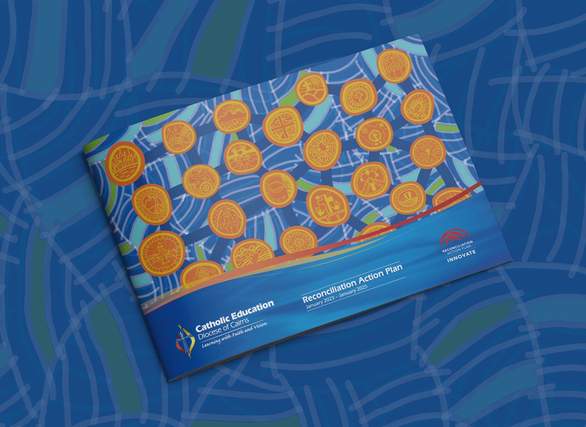
Integral to the entire design process of crafting a distinctive narrative for their RAP design was the development of a design meant to evolve and grow throughout their Reconciliation journey. Given the diverse group of schools spread across the Far North Queensland region, a crucial aspect of the design process was creating something that would unify each school and foster collaboration among the young students.
Commencing the initial design phase, we crafted a unique master design narrating their journey. We then engaged our client to involve each school, enlisting students in the creation of an Acknowledgment icon tailored to their school, seamlessly integrating into the master design. Over the span of a year, these icons were developed by students from each school, which we then refined into graphical elements that seamlessly merged with the master design.
The collaborative effort with thirty schools not only introduced them to their respective local communities but also wove a distinctive tale of Reconciliation. Through the eyes of both Aboriginal and Torres Strait Islander students, each school contributed to a unique and collaborative design piece, encapsulating the essence of their collective journey.


Creating unique identities
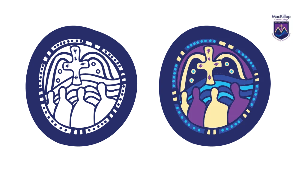
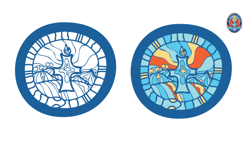
The Acknowledgment icon for each school within the Diocese of Cairns was collaboratively crafted by young individuals and is now integrated with the school emblem. This serves as a constant reminder of each school’s dedication to Reconciliation and its inherent ties to the surrounding lands.
These icons are versatile, suitable for use during celebratory occasions like NAIDOC Week and Reconciliation Week, extending to become a part of everyday materials within the school. Each icon is reproduced in a monochromatic state, ensuring it complements rather than overwhelms the school’s logo.
In instances where the icon is not used alongside the school’s logo, it adopts the school’s color palette, as illustrated in the following examples.
Despite being a colossal design project, our proposal to engage young people from each school forged an enduring connection to the communities, narrating an authentic journey of Reconciliation that instills a sense of pride in everyone involved.


